Kernel Wealth
Kernel Wealth is a digital wealth platform helping New Zealanders build long-term financial freedom through a modern suite of investment and savings products. From index funds to high-interest savings, cash funds and bonds, US shares and ETFs, and KiwiSaver, Kernel offers a seamless way to grow and manage your money in one place. With a focus on transparency, automation, and long-term performance.
As Kernel’s product suite expanded beyond index funds into savings, KiwiSaver, and direct investing, it became clear that our original pricing model no longer reflected the value we were offering. Past fee structures often caused confusion and didn’t scale well with the evolving business. To support long-term growth and fund ongoing development of new technology-driven features, we needed a pricing model that balanced revenue sustainability with clear value for customers.
I designed the in-app pricing experience, including plan selection flows, upgrade funnels, and plan management (updating, cancelling, and transaction history). I also built a marketing site to support the rollout and drive conversions.
As at July, 2025
76.6%
Paid users on plus plan
23.4%
Paid users on premium plan
9.38%
Overall conversion of users who engaged with pricing
62.98%
Conversion of users who selected a plan
Design challenge
“How might we evolve Kernel’s pricing to reflect growing value, without losing trust or accessibility?”
Chapter
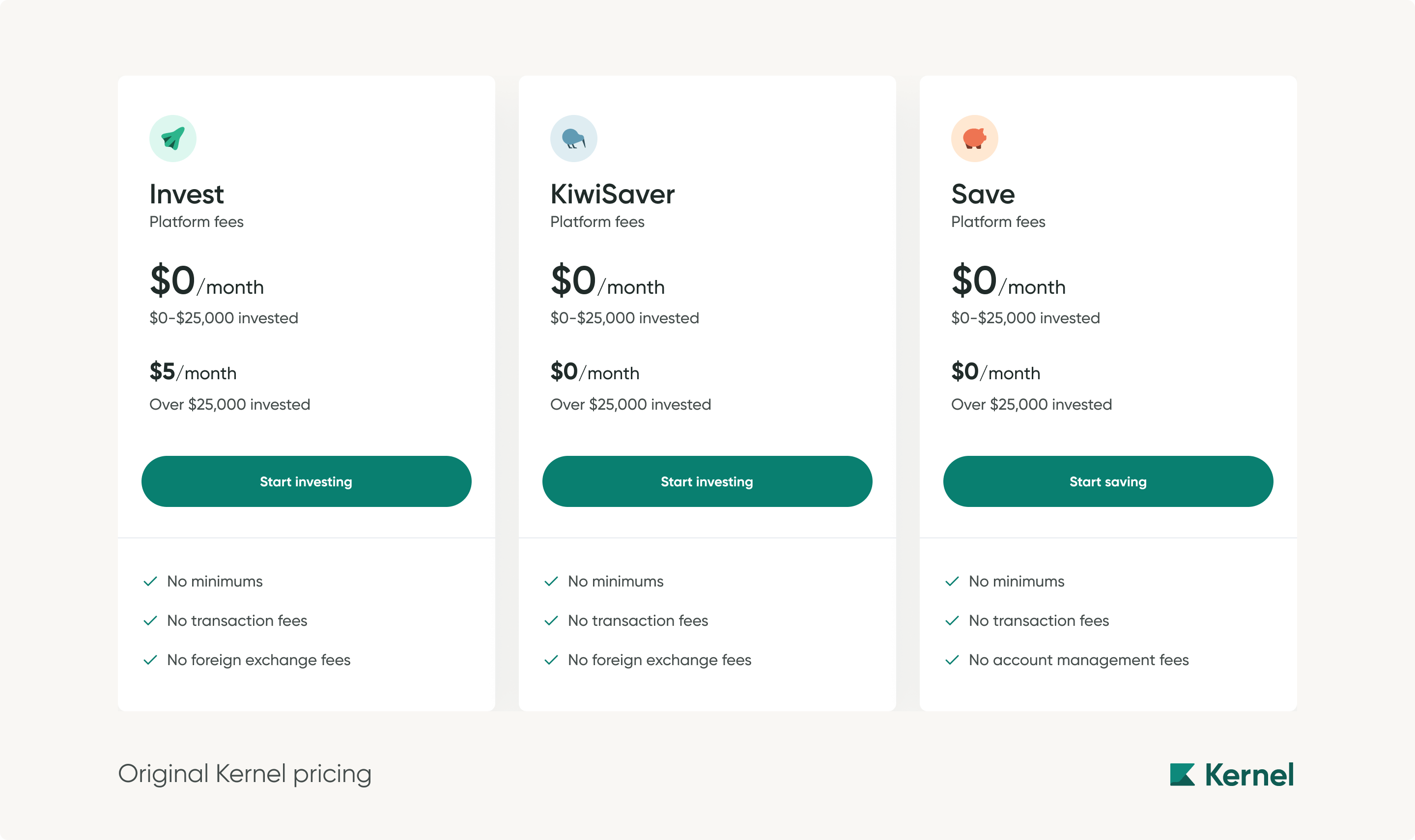
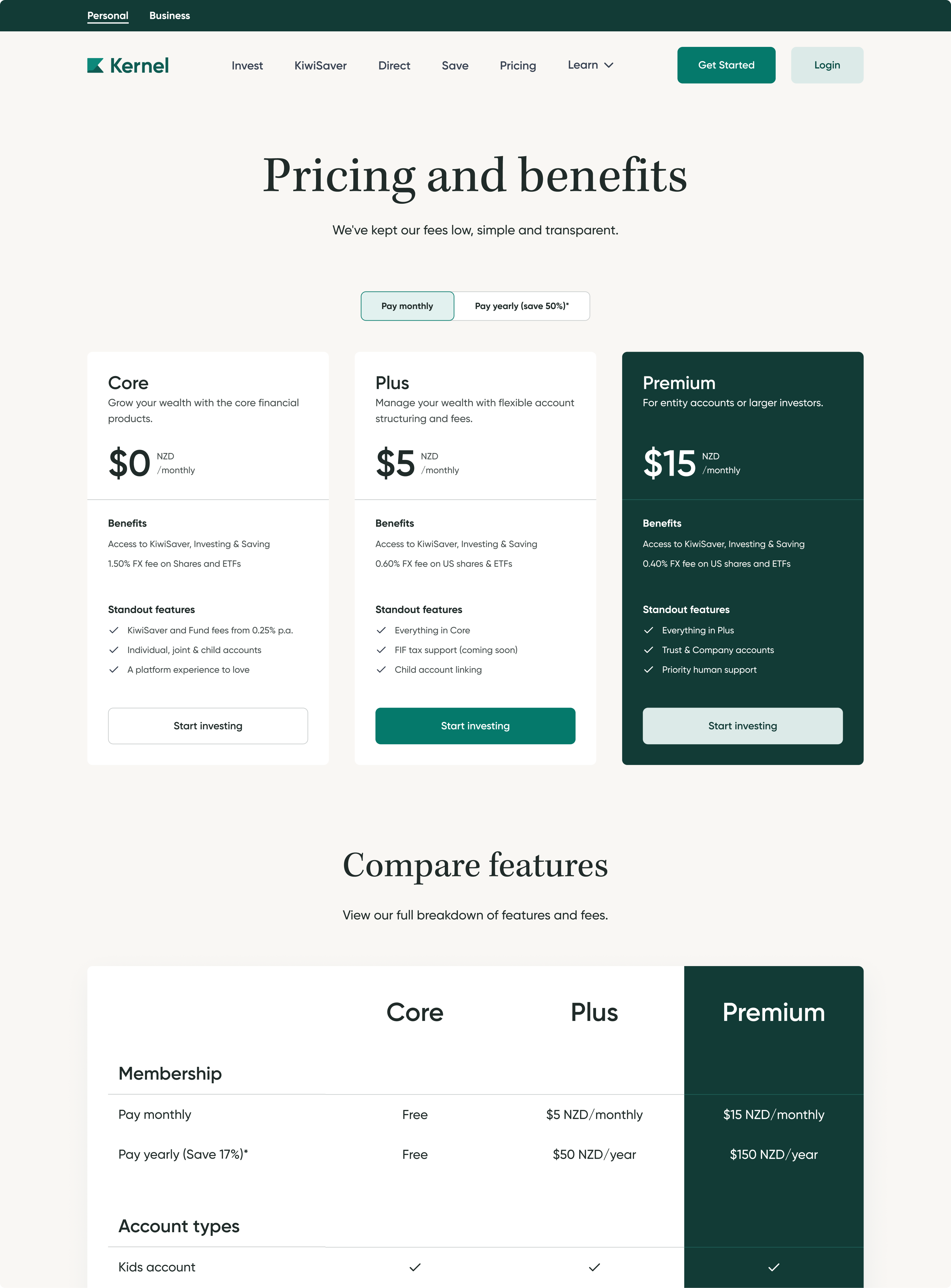
Kernel’s fee structure has changed a few different times since I've joined. As an example our fee structure from 2020-2023 was simple but poorly understood. We had a $5 membership fee for portfolios above a $25K threshold which generated user confusion and frustration. Due to it being automatically taken from a users wallet, users would see it as a mistake or unexpected cost. This was removed in 2024, but there were still issues with this model for the business. Our pricing didn’t match the varied levels of service our users needed. So we wanted to design a pricing model and experience that was more flexible and empowering, with a clear value to the user.
As we evolve Kernel from a pure fund provider into a broader wealth platform including technology-driven features we needed a pricing model that better reflected this move. I assisted our product lead with research into different models. We supplemented this model research with anonymous surveys to test sensitivity to different price points and value propositions. For this case study I will be focusing more on how design was a central part to communicating our new pricing to users.
Chapter
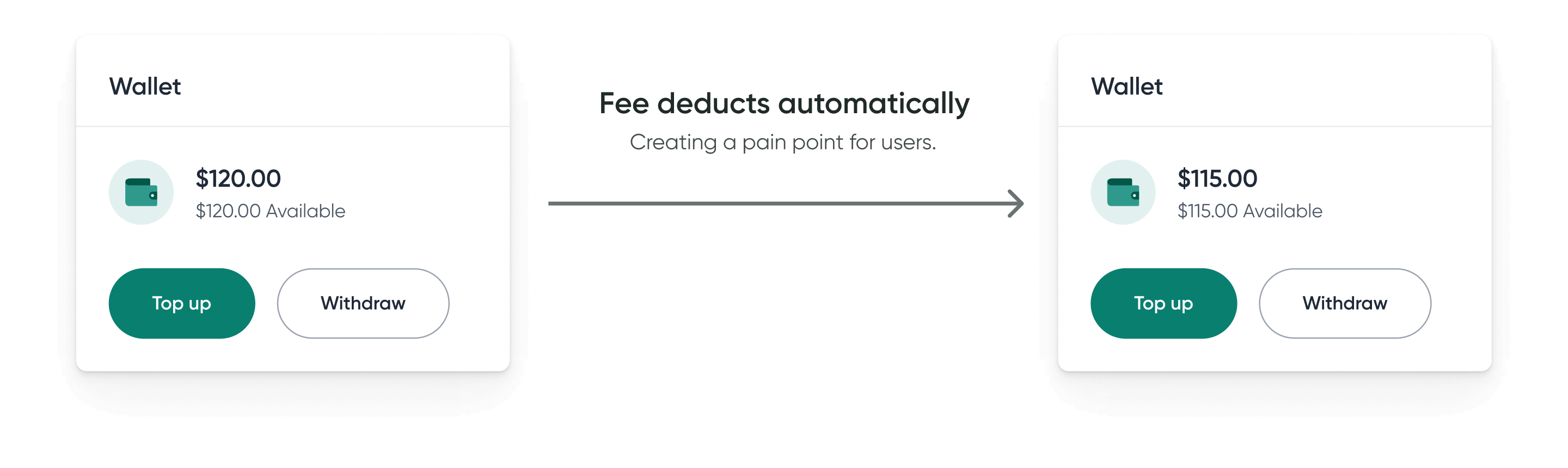
In the past we had used the "Kernel Wallet" (their account's bank account used for transfers in the product) to pay fees. This would create pain points as unexpected fees could interrupt scheduled investments. For this reason our new pricing would be using a stripe integration to enable card payments.
Another key challenge was deciding which features to monetise and how to communicate this clearly to users. Our previous fee structures often left customers questioning the value, so this time it was critical to create a stronger connection between price and perceived benefit.
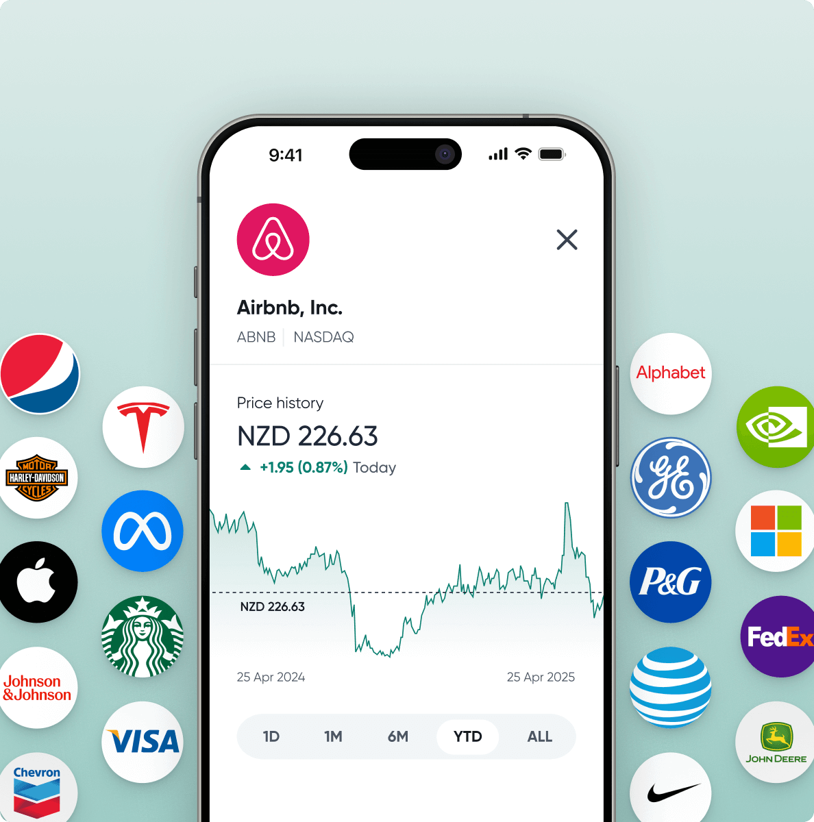
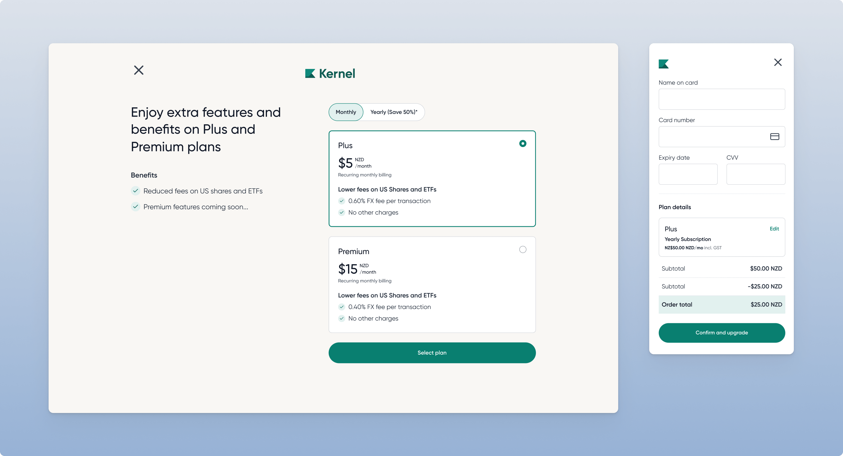
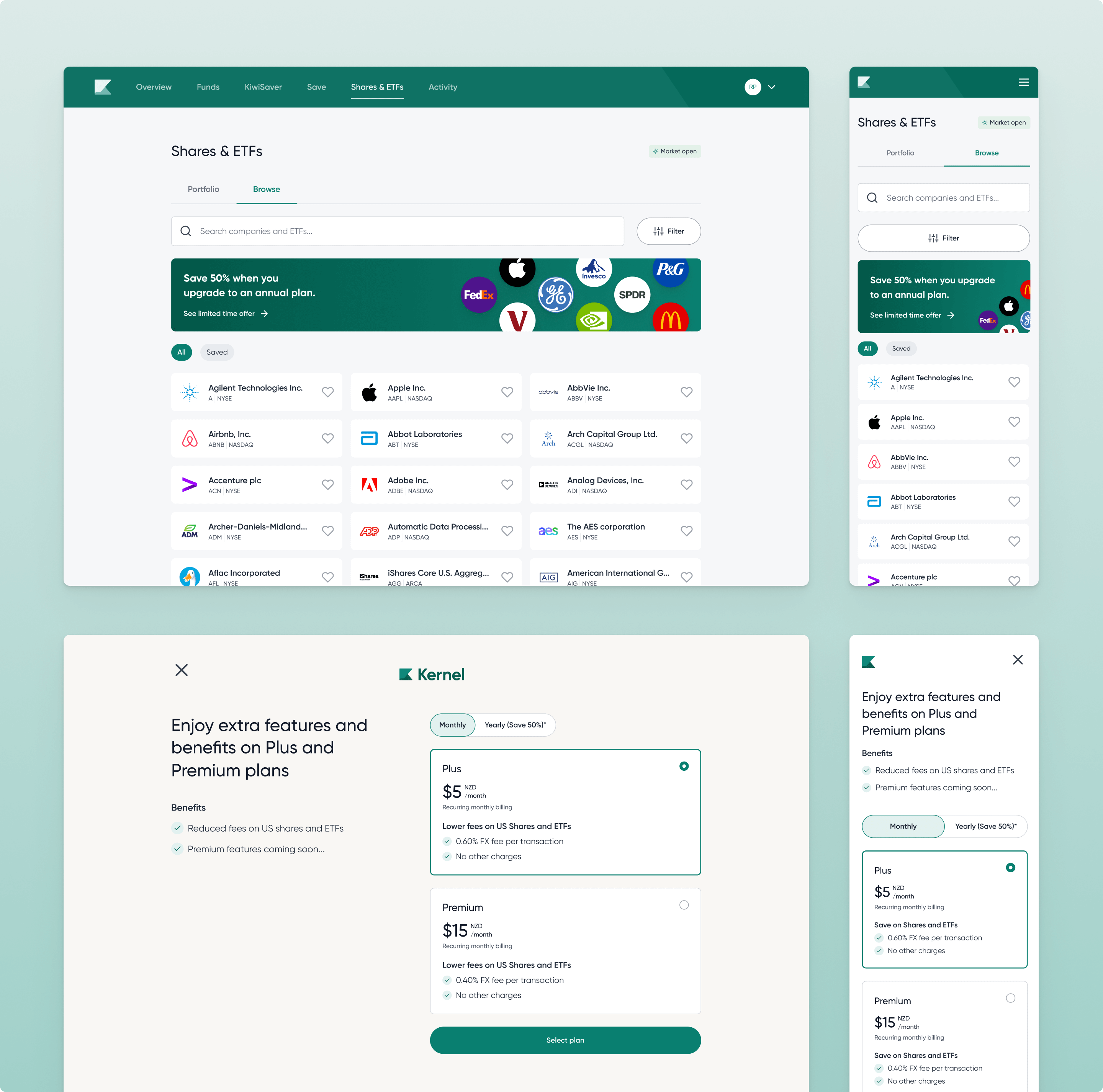
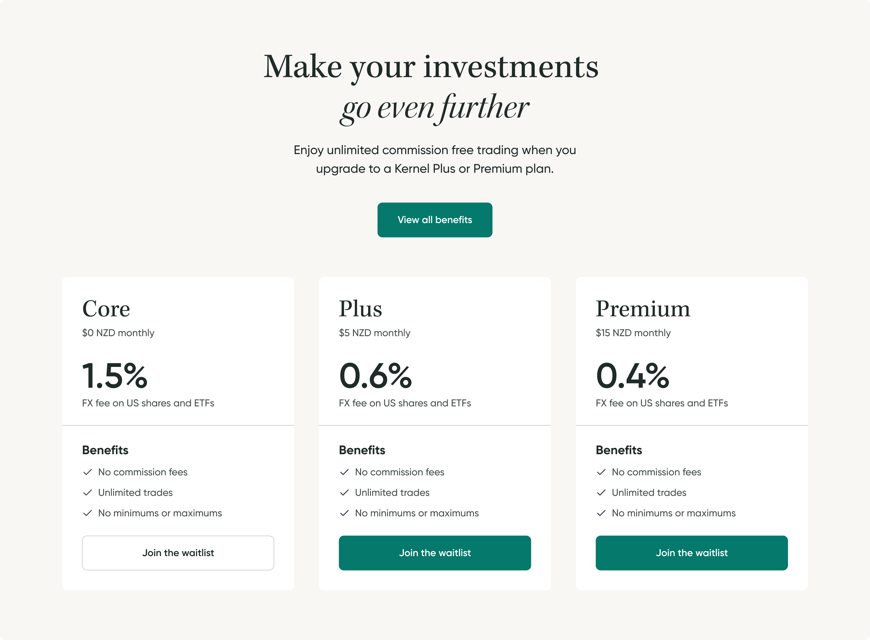
The launch of Shares and ETFs gave us a tangible value-add to pair with the introduction of paid plans, with the intention of building on this over time. Initially, we explored locking Shares and ETFs behind a paywall, but requiring upfront payment risked alienating new users. Instead, we introduced a flexible model offering both one-off trades and subscription pricing giving users choice, reducing friction, and better matching different usage patterns. Additionally I suggested the option of a monthly payment and an annual payment. Giving people the choice of flexible payments over greater long term value.
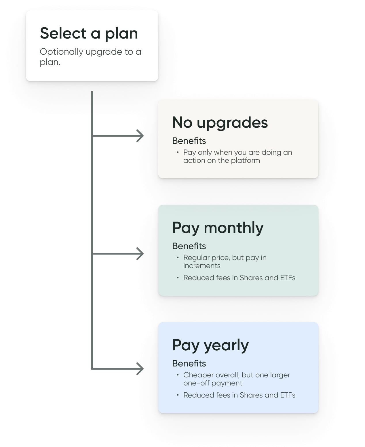
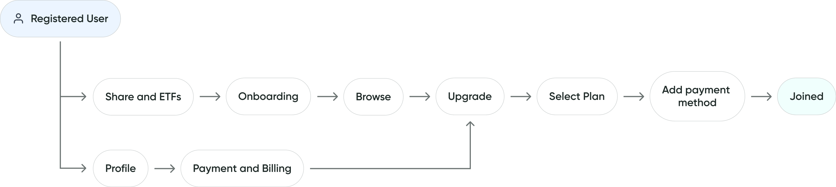
Given that Shares and ETFs already required complex onboarding for regulatory reasons, I prioritised reducing friction where possible focusing on clear pathways to completion before surfacing pricing options. I recommended integrating the subscription offering during the browsing experience, tying pricing benefits directly to the products users were exploring.
Chapter
I focused much of the design effort on plan selection and payment, as these screens needed to communicate several messages at once: what upgrading includes, differences between Plus and Premium, monthly vs annual pricing, and above all why it’s worth upgrading. The challenge was simplifying these layers into a clear, focused moment of decision.
The design evolved through multiple iterations. Early versions compared free vs paid plans, but this created unnecessary friction. Through feedback and testing, I shifted to only highlighting Plus and Premium, removing mention of the free Core plan to reduce load. The hierarchy led with plan tiers, followed by billing frequency, with a default option pre-selected to guide focus.
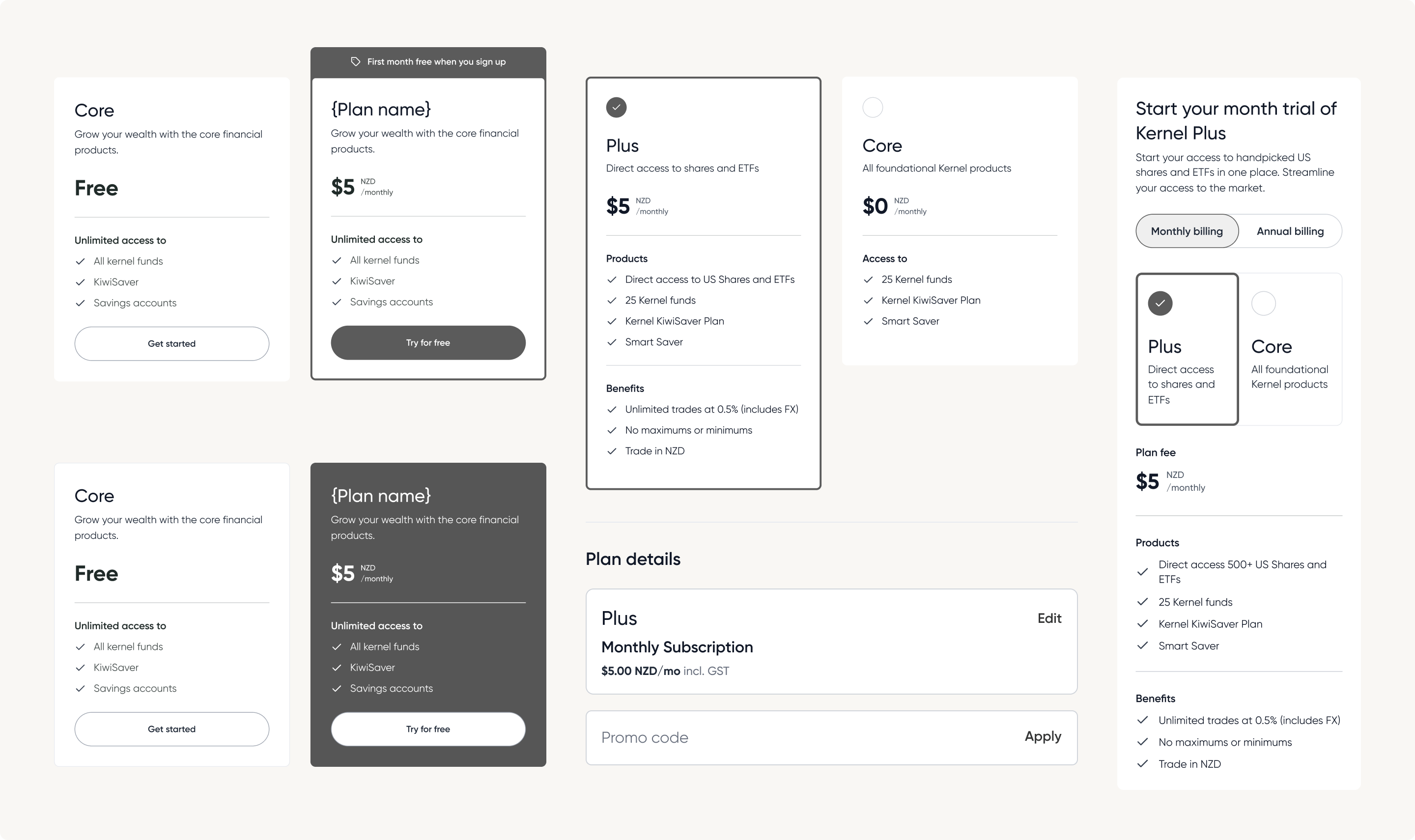
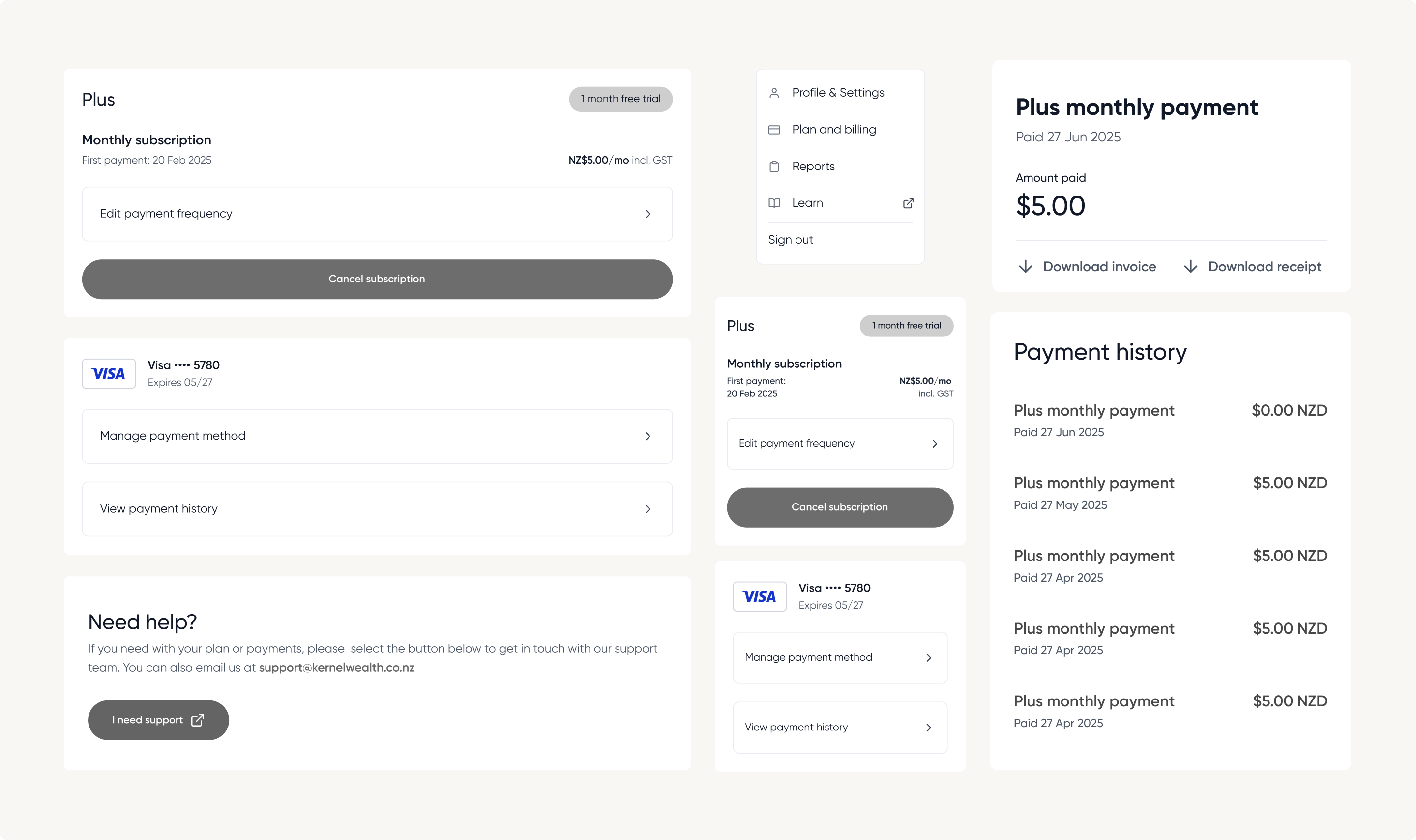
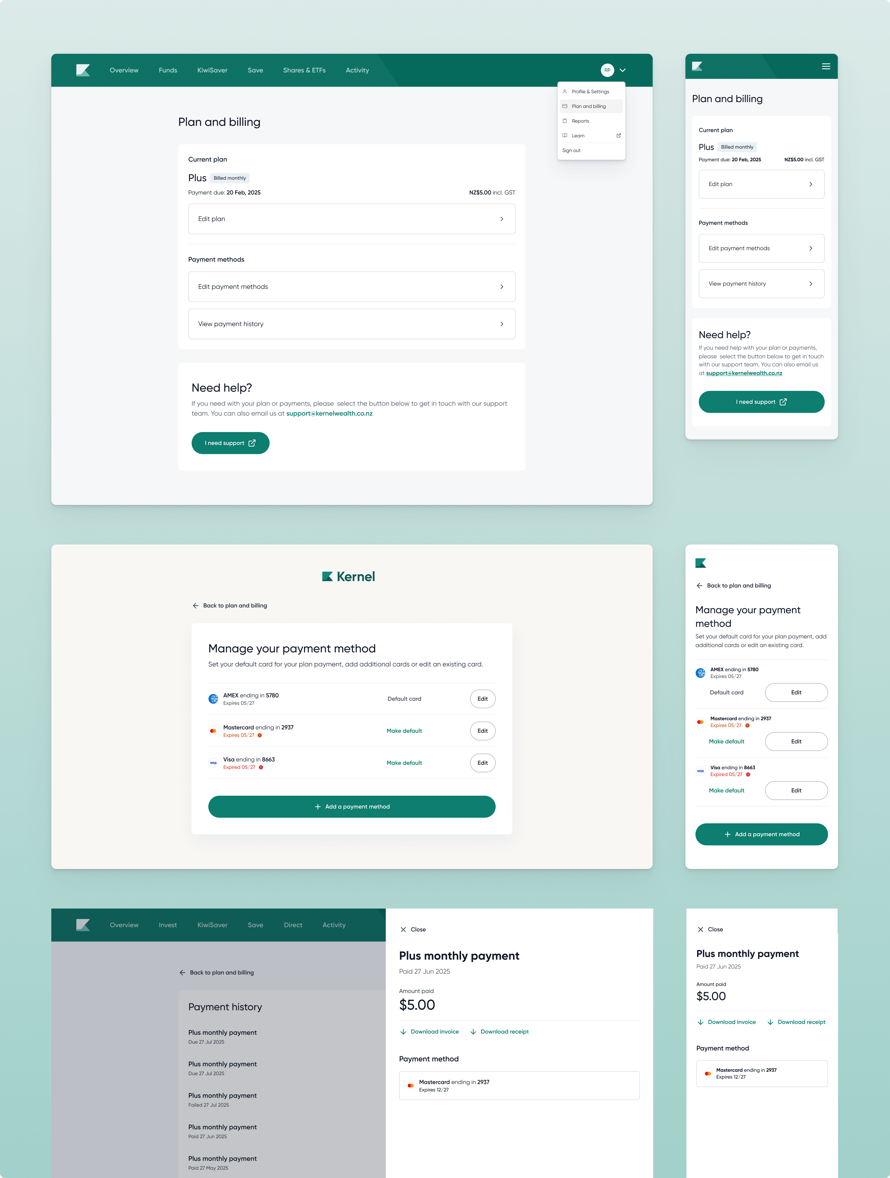
The profile page involved close collaboration with development as the team were still familiarising themselves with the Stripe integration. The focus was on clear visibility of the current plan, straightforward cancellation, and surfacing the credit system to handle refunds without complicating the Stripe flow.
Chapter
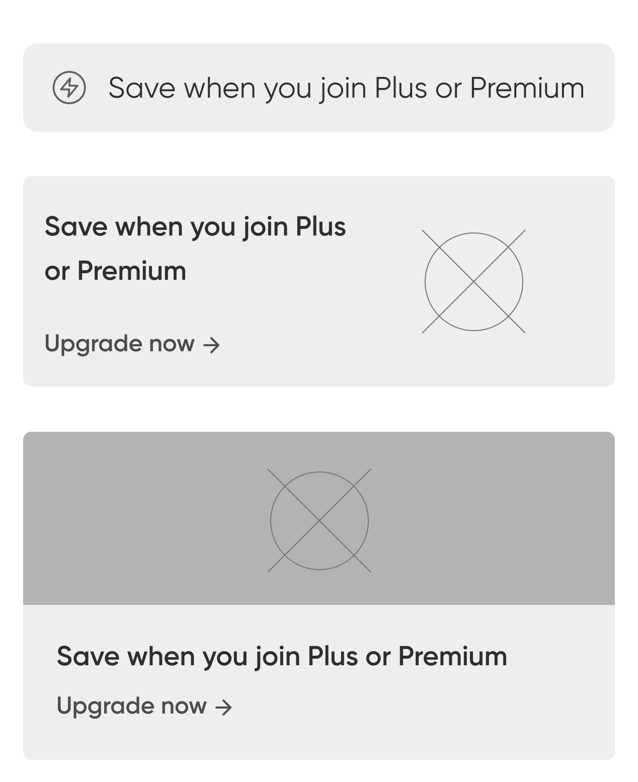
To encourage adoption, I used promotion logic and UI cues that emphasised potential savings and future benefits. Stripe has some design limitations when it comes to cards and payments. I worked closely with developers to navigate its UI limitations, ensuring key flows like card addition and error recovery were on brand, robust and user-friendly.
Once subscribed, users could see their fee savings reflected directly in their investment transactions reinforcing the value proposition post-conversion.

With Stripe integration came the need for payment management tools like card storage, billing history, plan upgrades, and cancellations. I recommended placing this under the user profile to avoid confusion with existing transaction areas, designing a modular system that could scale with future needs. There are a lot of edge cases with cards and payments so it required close collaboration with QA and engineering teams, ensuring we covered every scenario for a seamless experience.
Chapter
As part of the pricing launch, I also updated the marketing site to introduce and reinforce the new narrative around Kernel’s value. Over time, our offering has become significantly broader, and this page needed to make that evolution clear and digestible for all users. My goal was to showcase just how much Kernel provides, not only financial products but also an expanding range of technology features. This gives the business a platform to highlight recent releases and preview what’s ahead.
The release of this page was timed to coincide with the launch of Shares and ETFs, as the initial pricing structure was closely linked to this new product. The pricing section I designed for Shares and ETFs matched the the in-app experience, focusing on the immediate value-add for that product while inviting users to explore a wider set of premium features if they were interested.
Chapter
As at July, 2025
76.6%
Paid users on plus plan
23.4%
Paid users on premium plan
9.38%
Overall conversion of users who engaged with pricing
62.98%
Conversion of users who selected a plan
Chapter
The rollout of the new pricing structure was smooth, with positive adoption and minimal load on our customer service team (which was a risk of the project). The new model is more flexible, user-aligned, and sets a strong foundation for future revenue growth.
We still have work to do in reinforcing the benefits of paid plans over time through dashboard cues, visual reminders of savings, and better messaging. Building perceived value from a price tag remains a difficult but important challenge as we expand Kernel’s offering.