Kernel Wealth
Kernel Wealth is a digital wealth platform helping New Zealanders build long-term financial freedom through a modern suite of investment and savings products. From index funds to high-interest savings, cash funds and bonds, US shares and ETFs, and KiwiSaver, Kernel offers a seamless way to grow and manage your money in one place. With a focus on transparency, automation, and long-term performance.
Kernel began as a disruptor in the index fund space, known for being simple, accessible, and transparent. As we grew into a broader wealth platform spanning savings, KiwiSaver, and goal-based investing the brand needed to evolve to match the company’s ambition and the emotional journey of our customers. The rebrand aimed to shift the narrative from purely financial tools to enabling life’s possibilities, combining a refreshed visual identity with a stronger focus on tech innovation and human-centred storytelling.
I worked alongside our graphic Designer to reimagine the Kernel Brand. I was responsible for the redesign of the marketing site, reimaging our design patterns and creating new illustrations and rules for marketing content.
As at July, 2025
+6%
Increase in brand Awareness (2024-2025)
16%
Brand awareness
15+
Redesigned pages
Design challenge
“How might we transform Kernel’s brand into a story that resonates with people’s financial journeys today and tomorrow?”
Chapter
Kernel had evolved from a challenger in the index fund space to an all-in-one wealth platform. Our brand once known for being approachable and simple needed to stretch to cover broader narratives: savings, KiwiSaver, financial goals, and all-in-one money management.
The competitive landscape was also shifting. As we moved into categories like savings and retirement, we were no longer just up against legacy fund providers but newer, emotionally-driven brands. We needed a story that reflected not just financial utility but human impact what money enables in people’s lives.
Chapter
While our graphic designer led the mood board for our new visual identity including photography, colour palettes, and typography, I was responsible for translating this into the marketing site experience. Without a large external campaign to lean on, the site became the key vehicle for public launch.
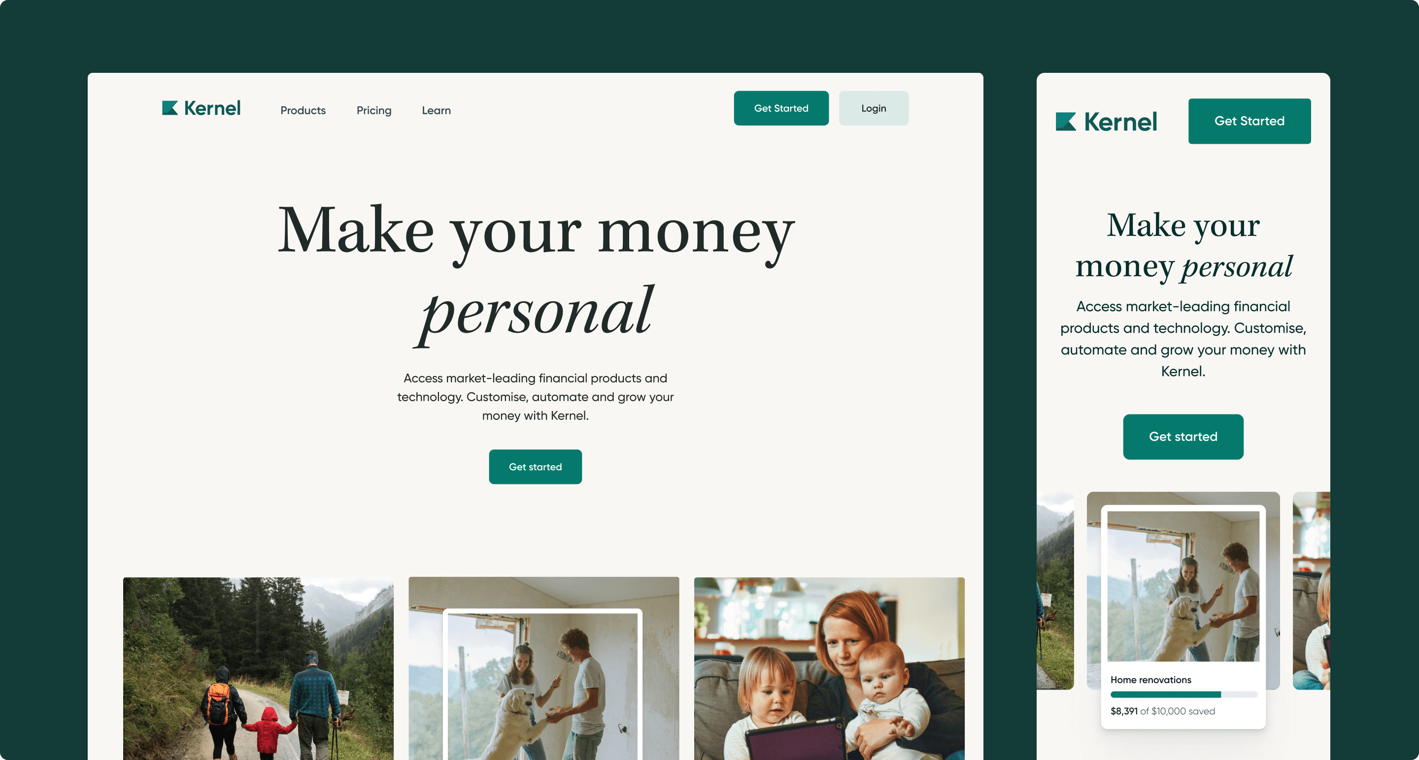
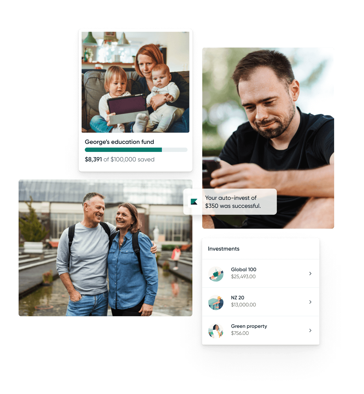
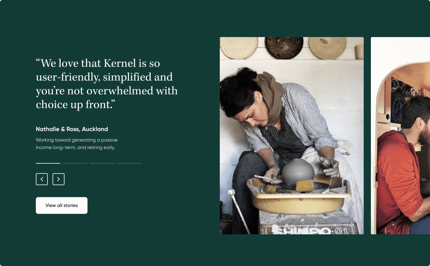
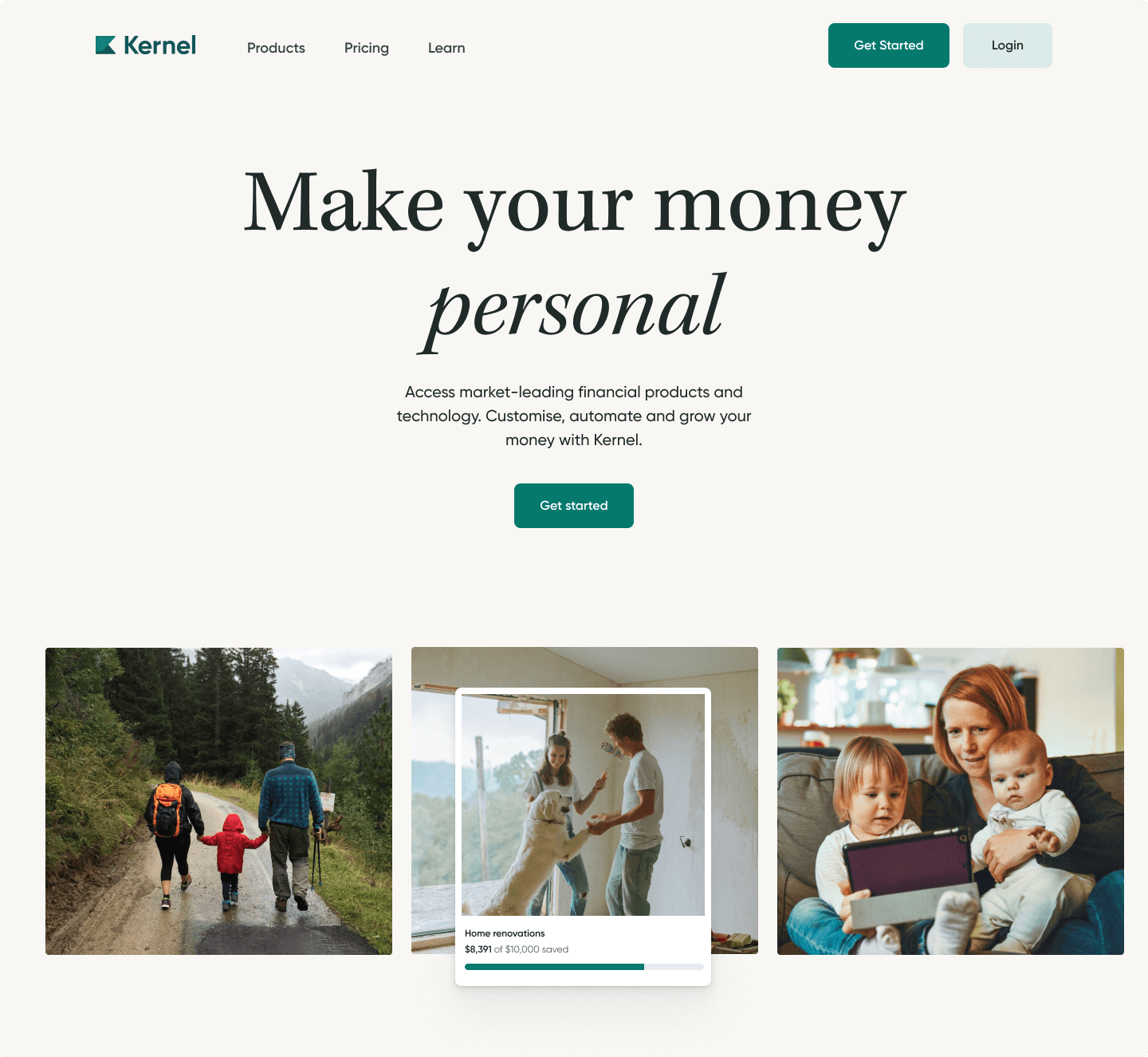
We shifted away from illustrations and leaned into real, human photography. Visual themes focused on progress, togetherness, and the richness of life made possible through financial freedom. I facilitated cross-functional brainstorms and working sessions to ensure brand alignment between teams based on customer insights and Kernel’s evolving mission.


Another strategic pillar was bringing technology to the forefront. We repositioned Kernel as not just approachable, but innovative. Investing heavily in digital experience. This shift influenced not just the design language, but the storytelling throughout the site, showcasing walkthroughs, modern interfaces, and signals of cutting-edge tech.
The previous site had minimal motion or interactivity. With the rebrand, I introduced animation and scroll effects to reinforce the themes of modern tech and effortlessness. Motion also allowed us to communicate more in less space, showing product stories or platform features without relying on multiple static images.
Chapter
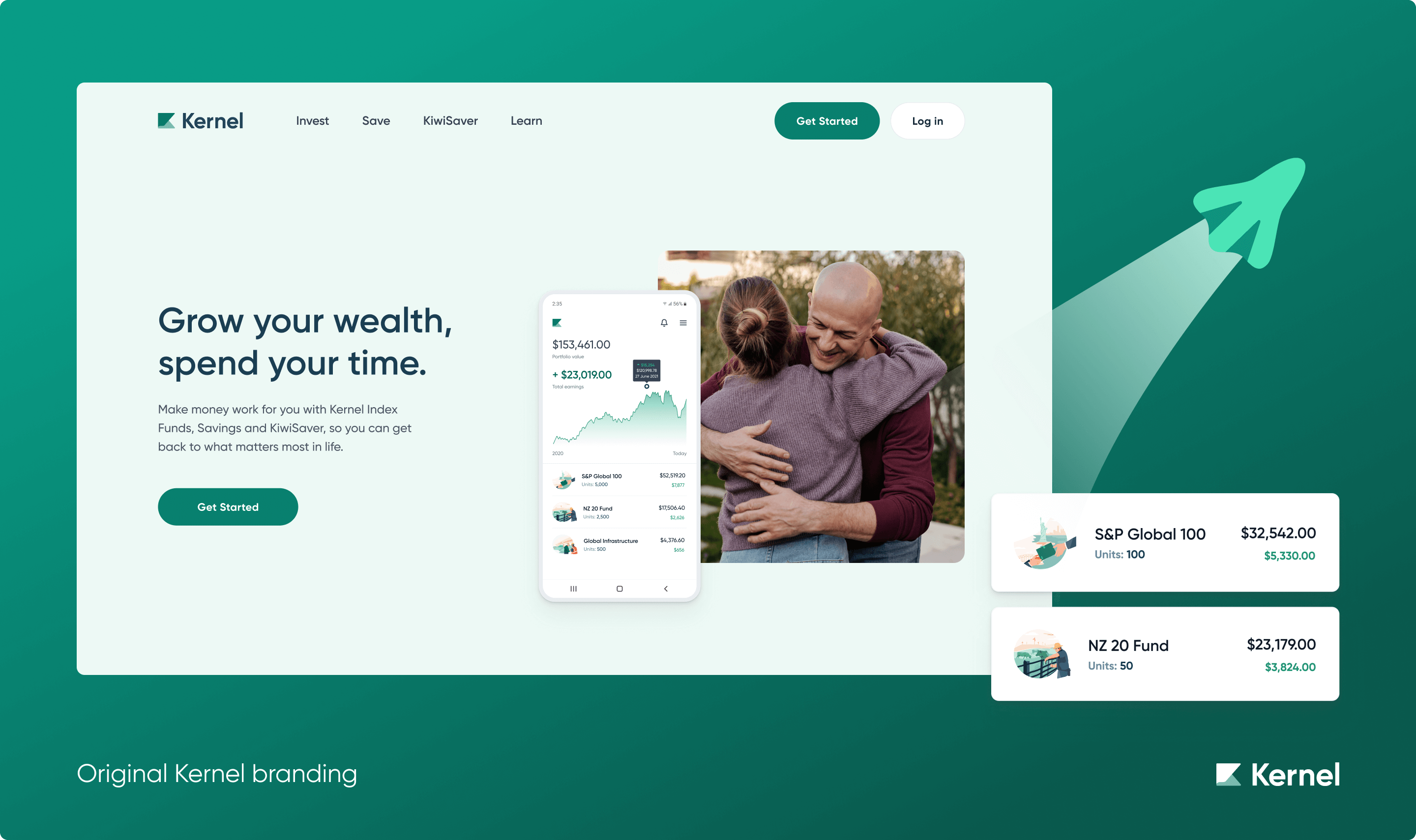
Each page layout was re-evaluated in collaboration with the wider team as we reprioritised messaging. Home page designs leaned into human narratives and storytelling, while product pages focused more on technology, innovation, and approachability.
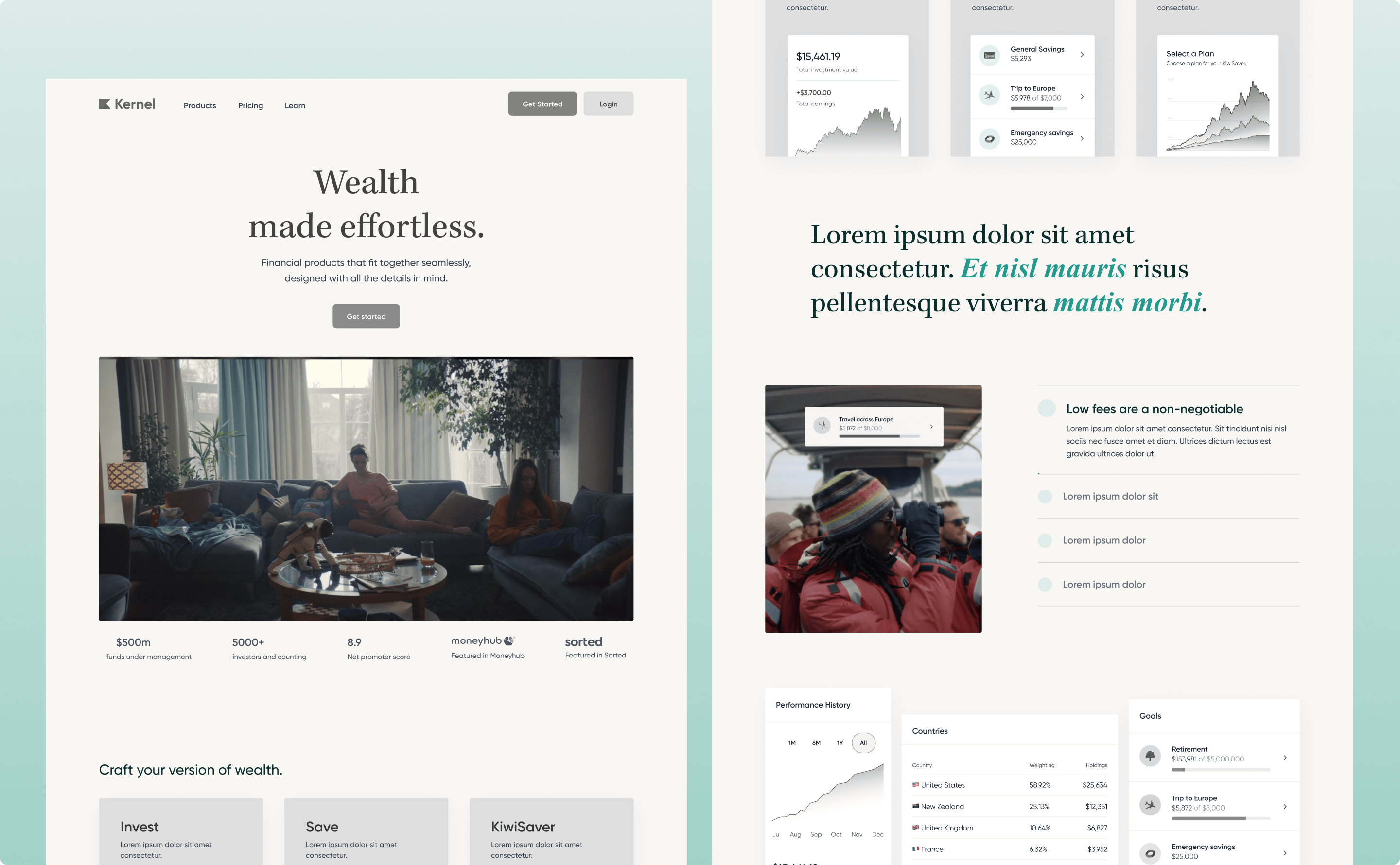
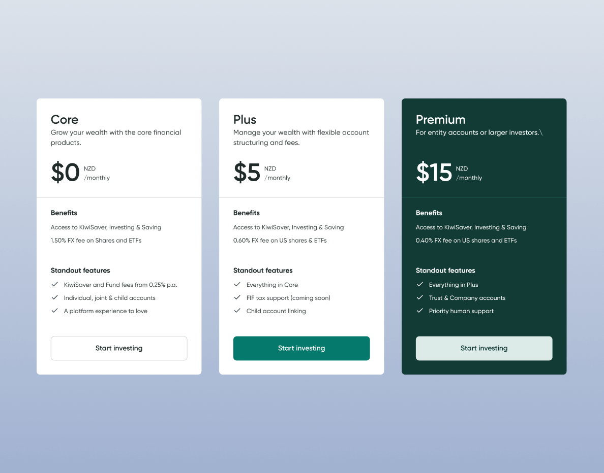
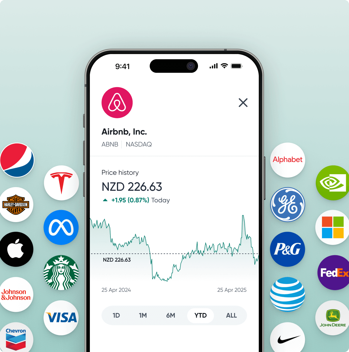
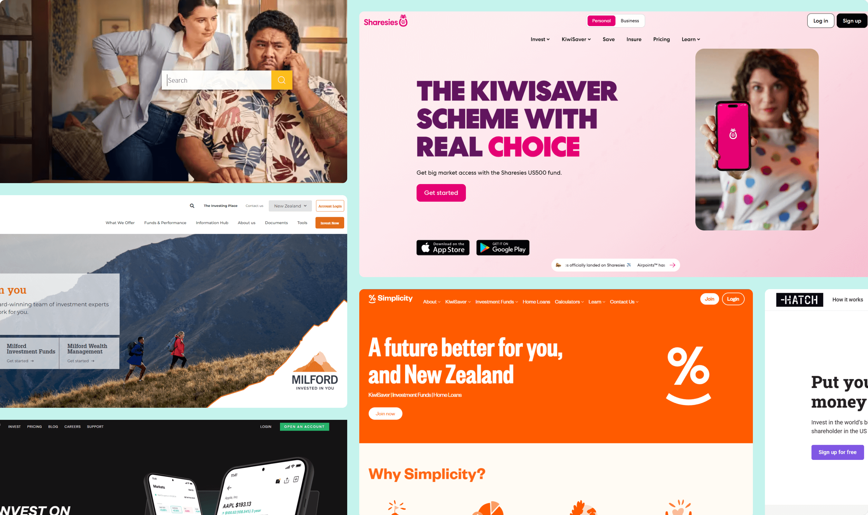
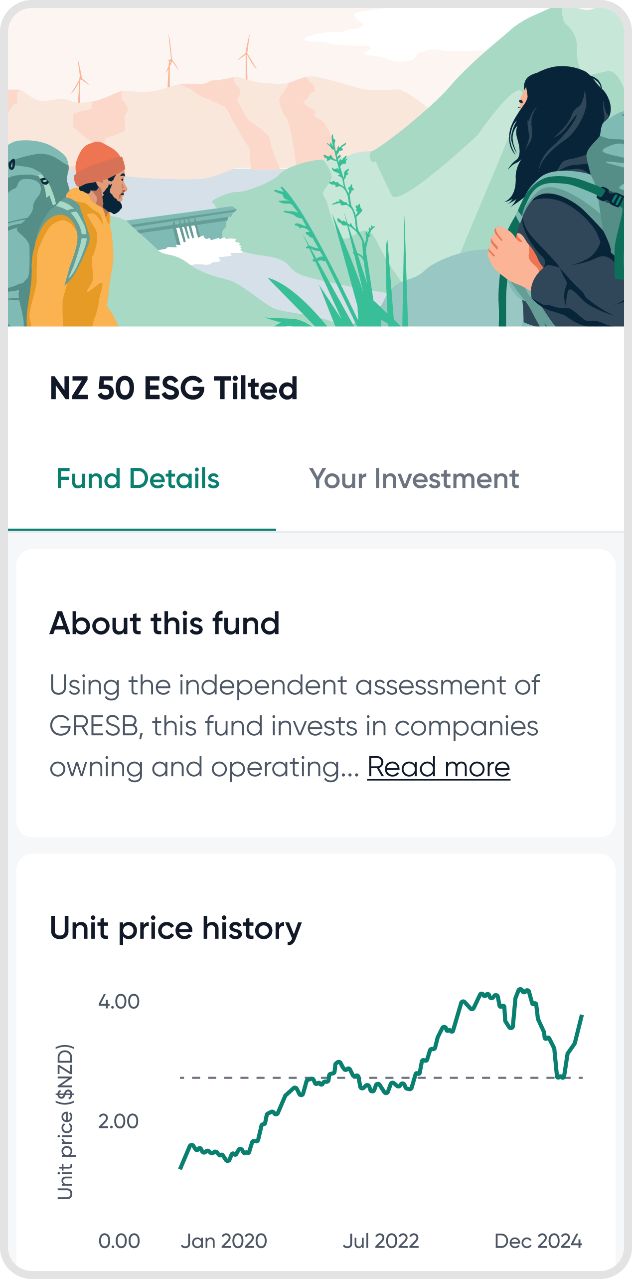
Some of our earlier imagery felt dense and overly complex, which no longer aligned with our brand direction. I shifted the visual approach to feel more relaxed and focused, zooming in on single moments (like a graph or chart) rather than full dashboards. Each section was anchored around one focal element, helping users digest the core message without distraction.
We brought real customer stories into more parts of the site, building a sense of trust and relatability. A wide range of imagery from families to retirees helped reflect the diverse life stages of Kernel’s audience, reinforcing the idea that wealth building is personal and inclusive.
Chapter
The rebrand became a big moment for the company signalling Kernel’s shift from a newcomer to a key player in the wealth space. The marketing site balanced sincerity, calm, and accessibility with a clear sense of momentum and innovation. We repositioned financial products as the supporting act with human stories and aspirations taking centre stage.
Chapter
As at July, 2025
+6%
Increase in brand Awareness (2024-2025)
16%
Brand awarenes
15+
Pages redesigned
Chapter
The rebrand delivered a strong, lasting identity without external agencies or large budgets. It's a real testament to our in-house collaboration. It provided Kernel with a more mature, credible foundation to build from, well-aligned to future growth.
A rebrand is never truly complete. Over time, I see opportunities to push the brand’s visual identity even further with more personalised, considered imagery and deeper storytelling, particularly around Kernel’s innovation in tech. As the brand evolves, so too will the creative expression needed to keep it distinctive and resonant.